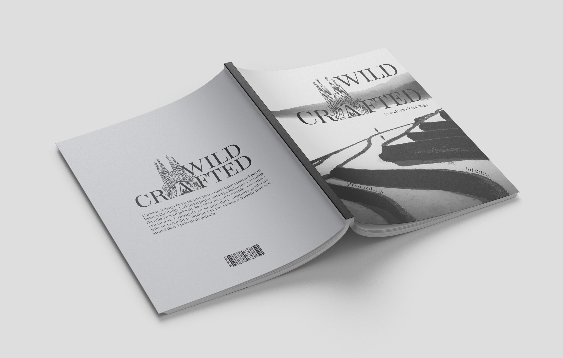
MAGAZINE DESIGN | Content editing & page layout
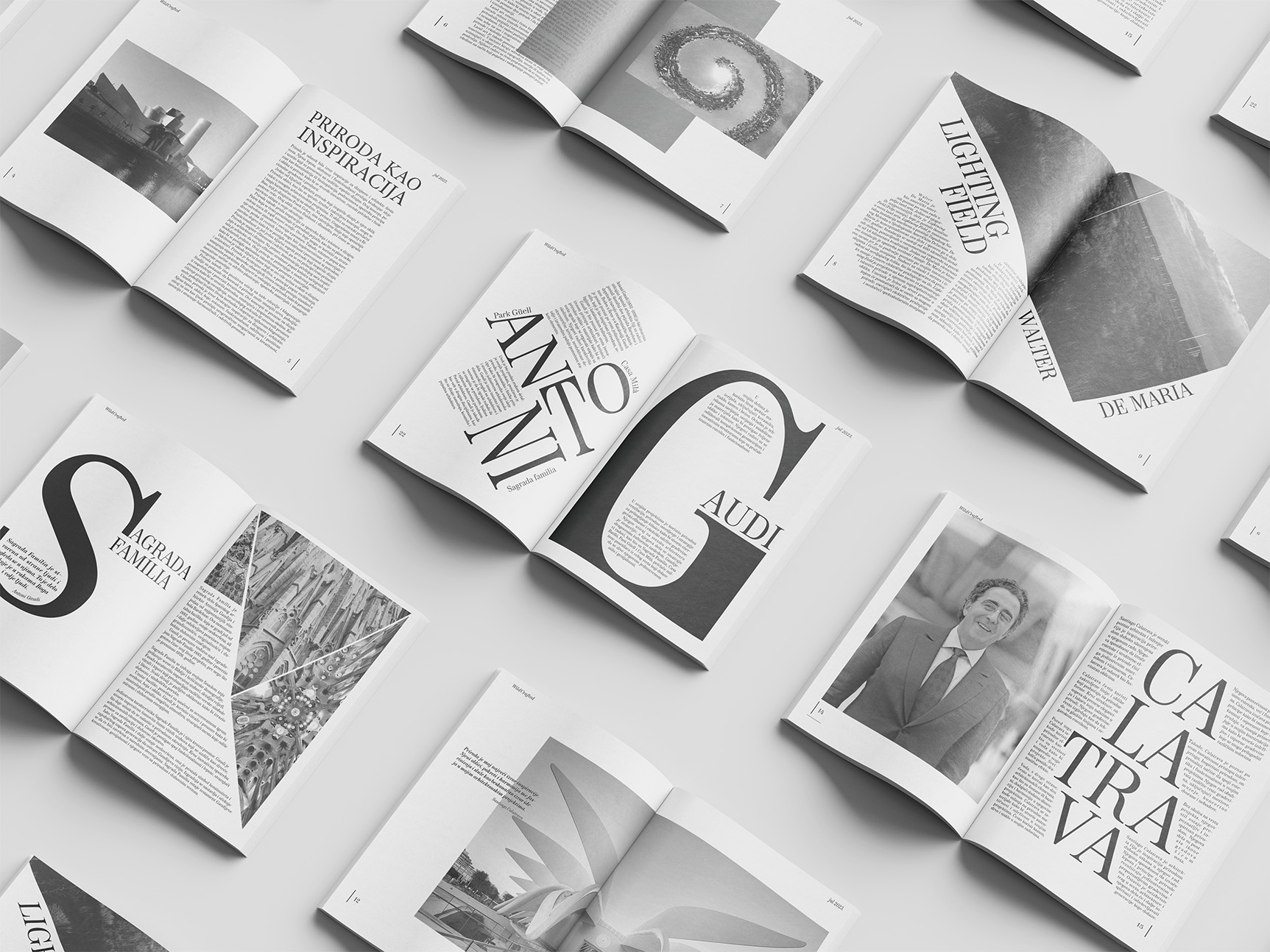
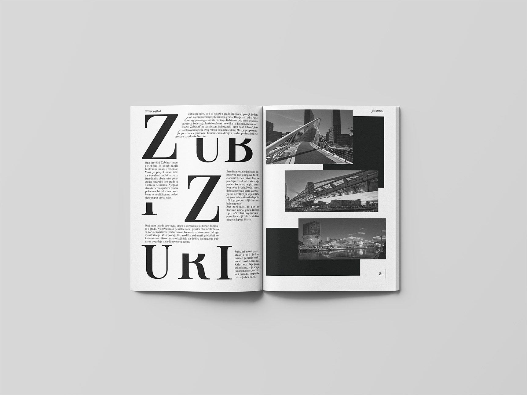
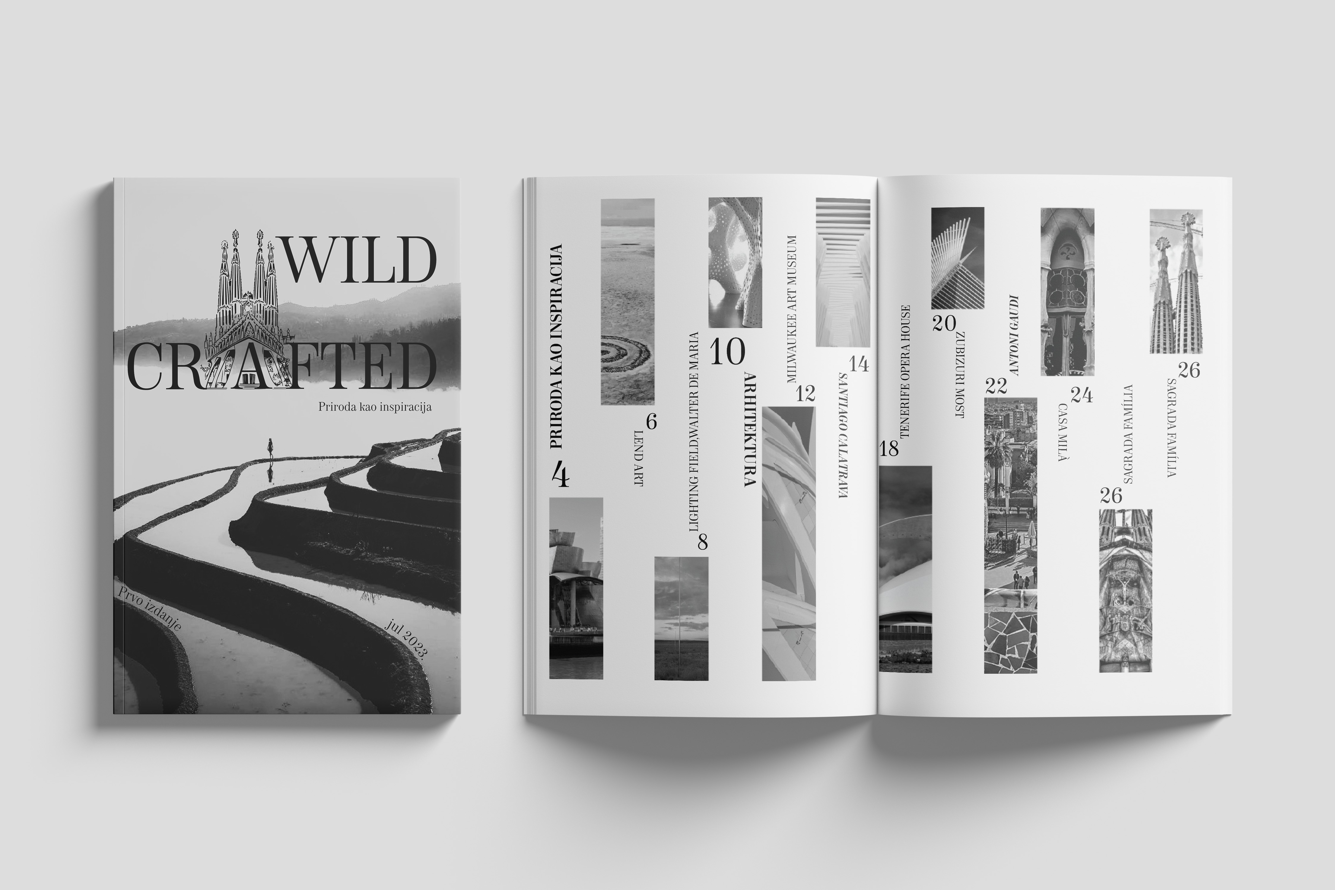
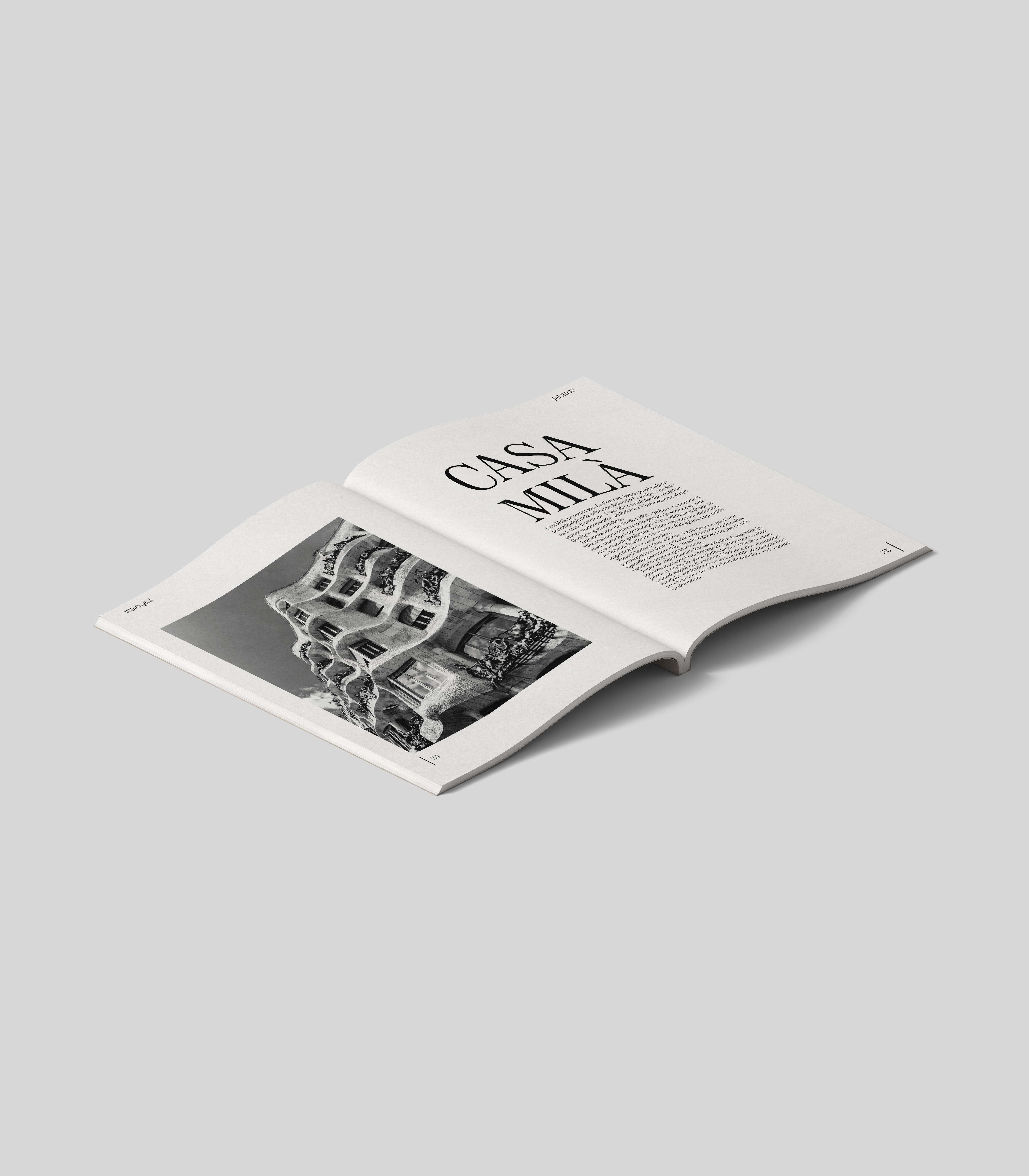
This project presents a magazine dedicated to architects and some of their most famous works. My focus was on experimenting with typography, text positioning, and layout in order to find the right balance between visual expression and readability.
Through typographic accents and dynamic compositions, I aimed to reflect the unique character of each building and its architect. An important part of the process was maintaining functionality and legibility, so that even with expressive layouts, the content remains clear, structured, and pleasant to read.