Project overview
The goal of this project was to design a logo and a short animation for a fictional organisation dedicated to nature conservation.
The butterfly was chosen as the central symbol, representing fragility, freedom, transformation and a close connection with nature. The visual concept was developed further through an animated sequence in which a storm scatters flower petals before the butterfly emerges and gradually forms the final mark.
The concept reflects both the vulnerability of nature and its ability to regenerate, transform and continue to evolve.
Logo Exploration
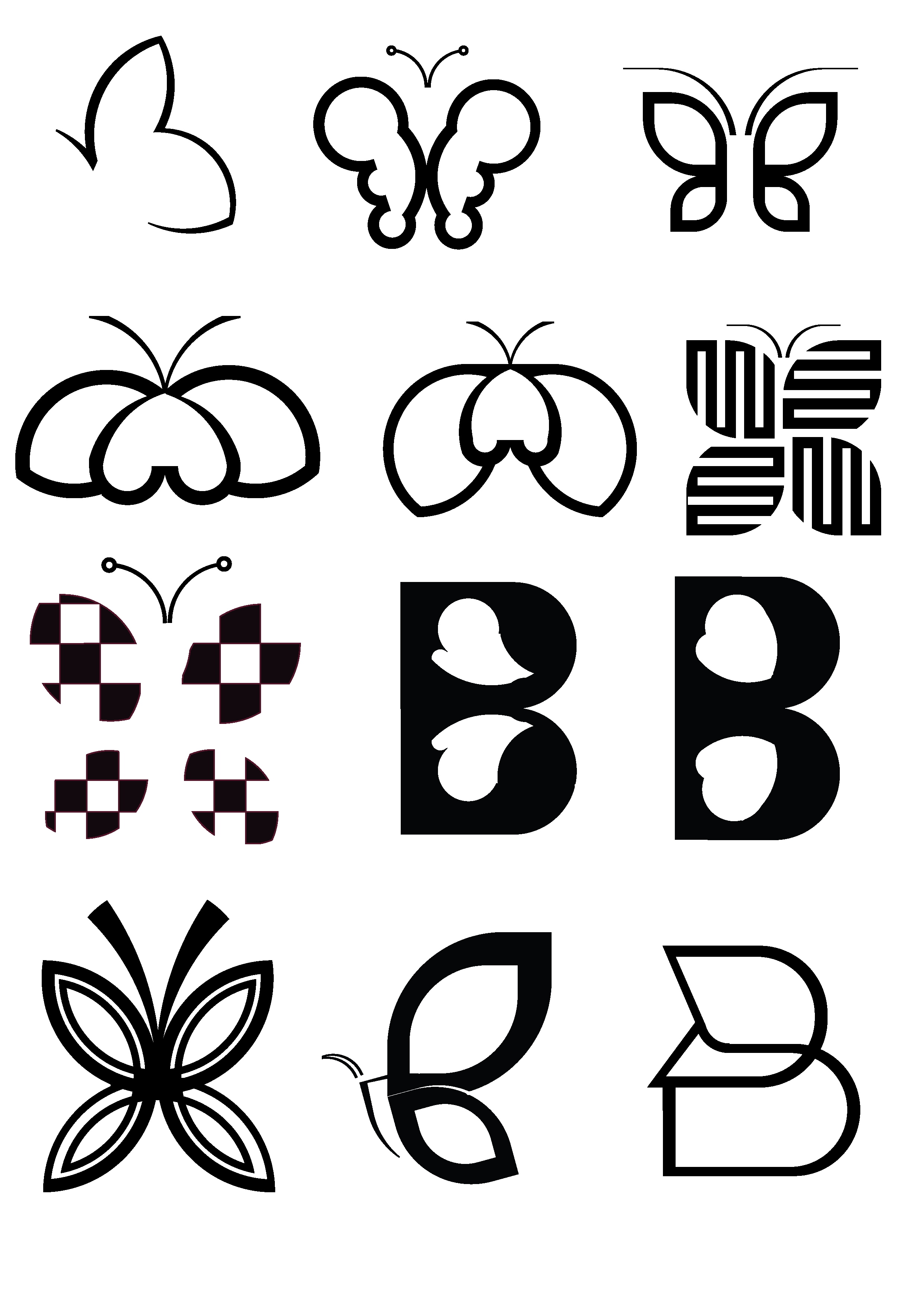
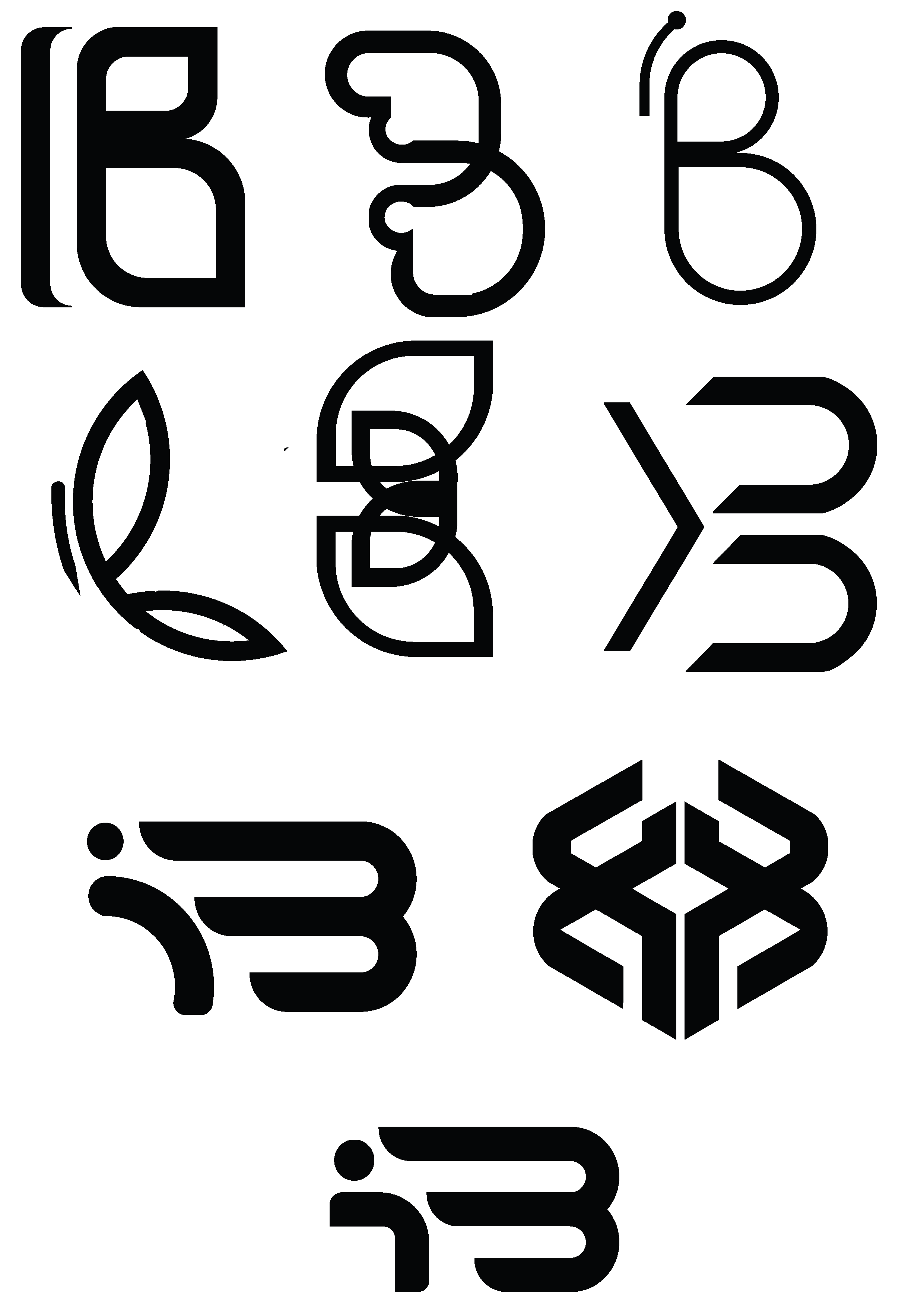
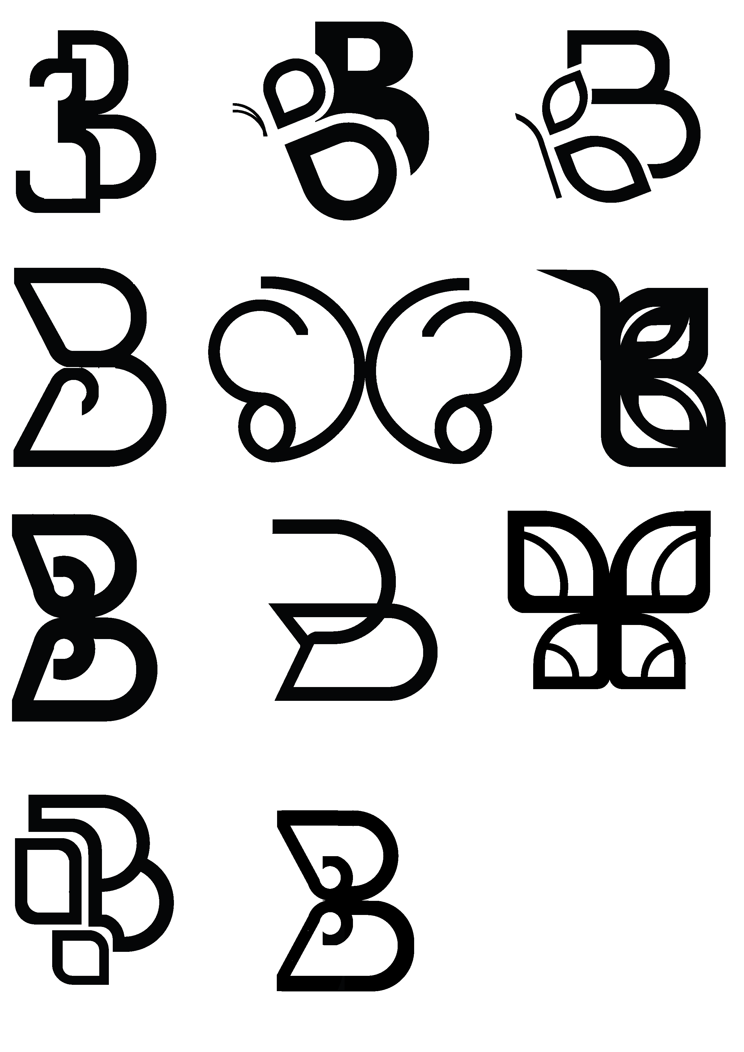
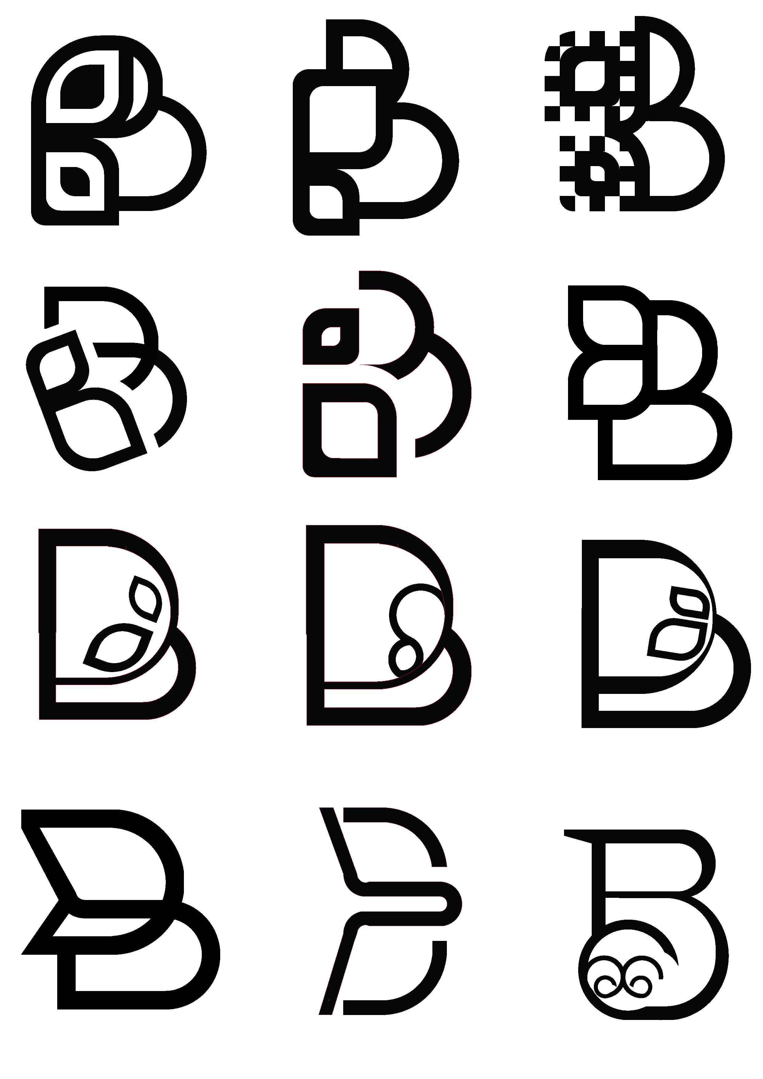
The design process explored different interpretations of the butterfly form, ranging from organic and illustrative approaches to more geometric and abstract solutions built around the letter B.
Final Logo
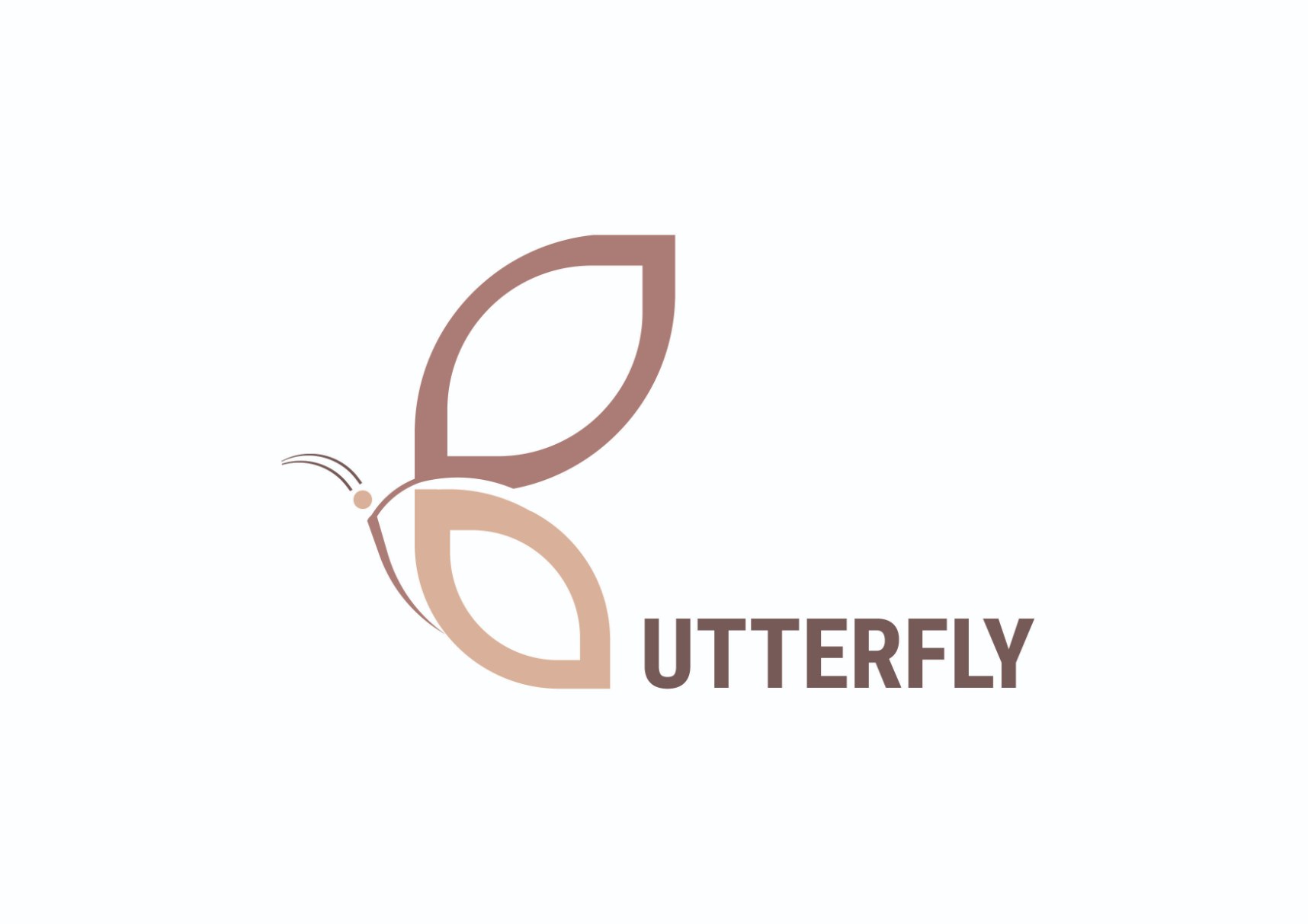
The final mark builds the letter B out of two leaf-shaped wings, so the symbol carries both the name and the subject at once - a butterfly read as a monogram rather than an illustration. The two wing tones and the thin antenna keep it light at small sizes.
Colour Palette
The warm, earthy palette was selected to reinforce the organic character of the identity and its connection to nature. The two wing tones carry the mark; white and a soft ink tone carry everything around it.
#976760
Muted Rose
RGB 151 · 103 · 96
#D0A186
Warm Sand
RGB 208 · 161 · 134
#FFFFFF
White
RGB 255 · 255 · 255
#1D1D1D
Ink
RGB 29 · 29 · 29
Applications
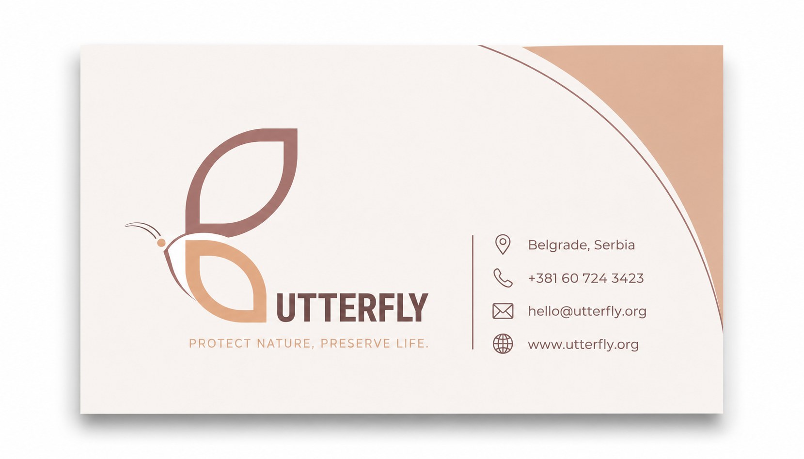
The identity applied to a business card, where the two wing tones carry the mark and the warm sand tone returns as a background shape.
Logo in Motion
The identity was brought to life through a short animation in which a storm scatters flower petals before the butterfly emerges and gradually forms the final logo.